
Pro Padel League
Developing a brand system for PPL, the premier professional padel league in North America.
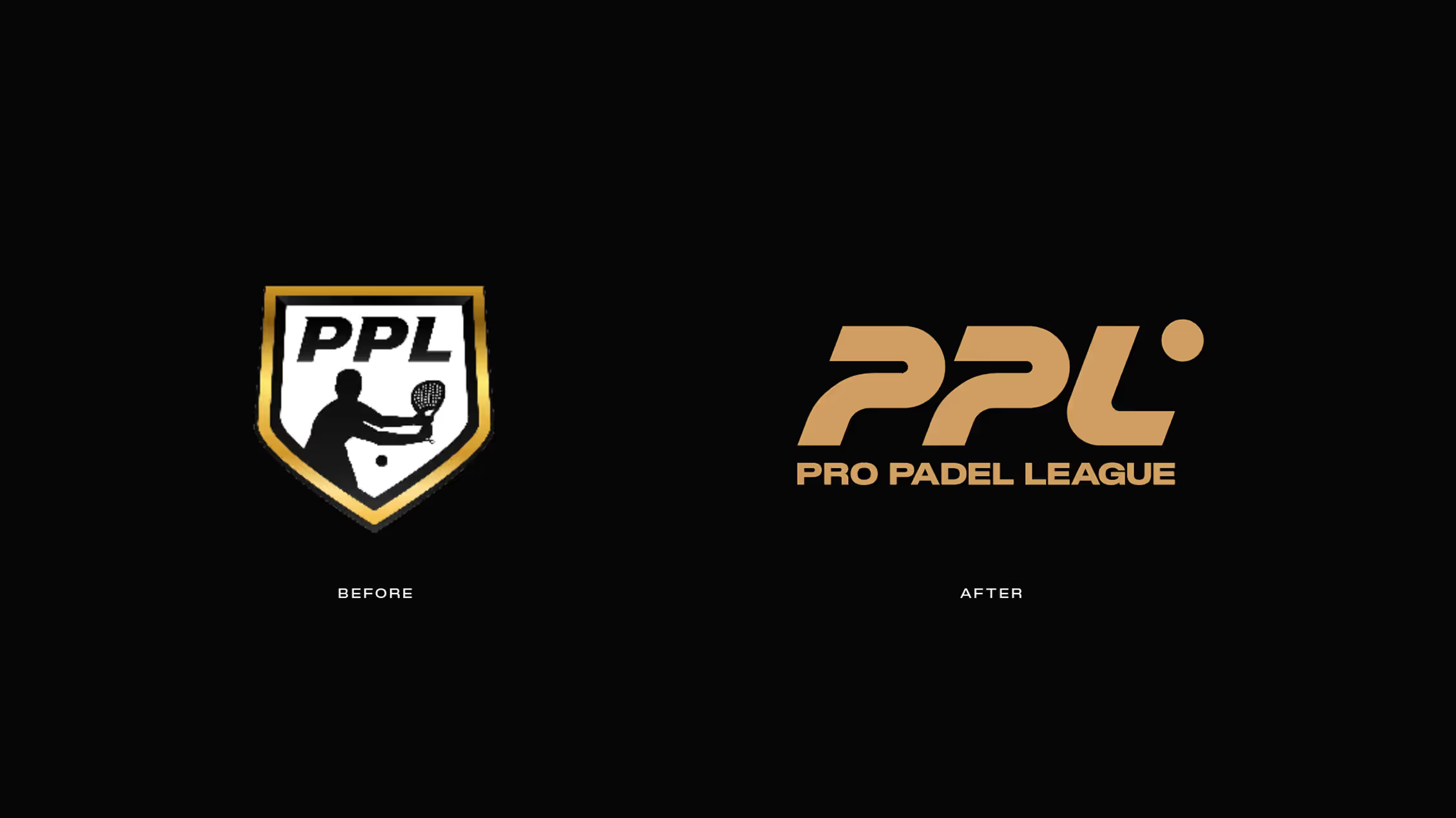
Pro Padel League (PPL) approached TWA with a need to develop a logo and system that supported the creation of a premier sports league and establish a large-scale stage for padel players across the region. As padel was quickly becoming the fastest-growing sport in the rest of the world, TWA supported PPL in bringing this dynamic sport to North America.
What We Did:
Brand Strategy
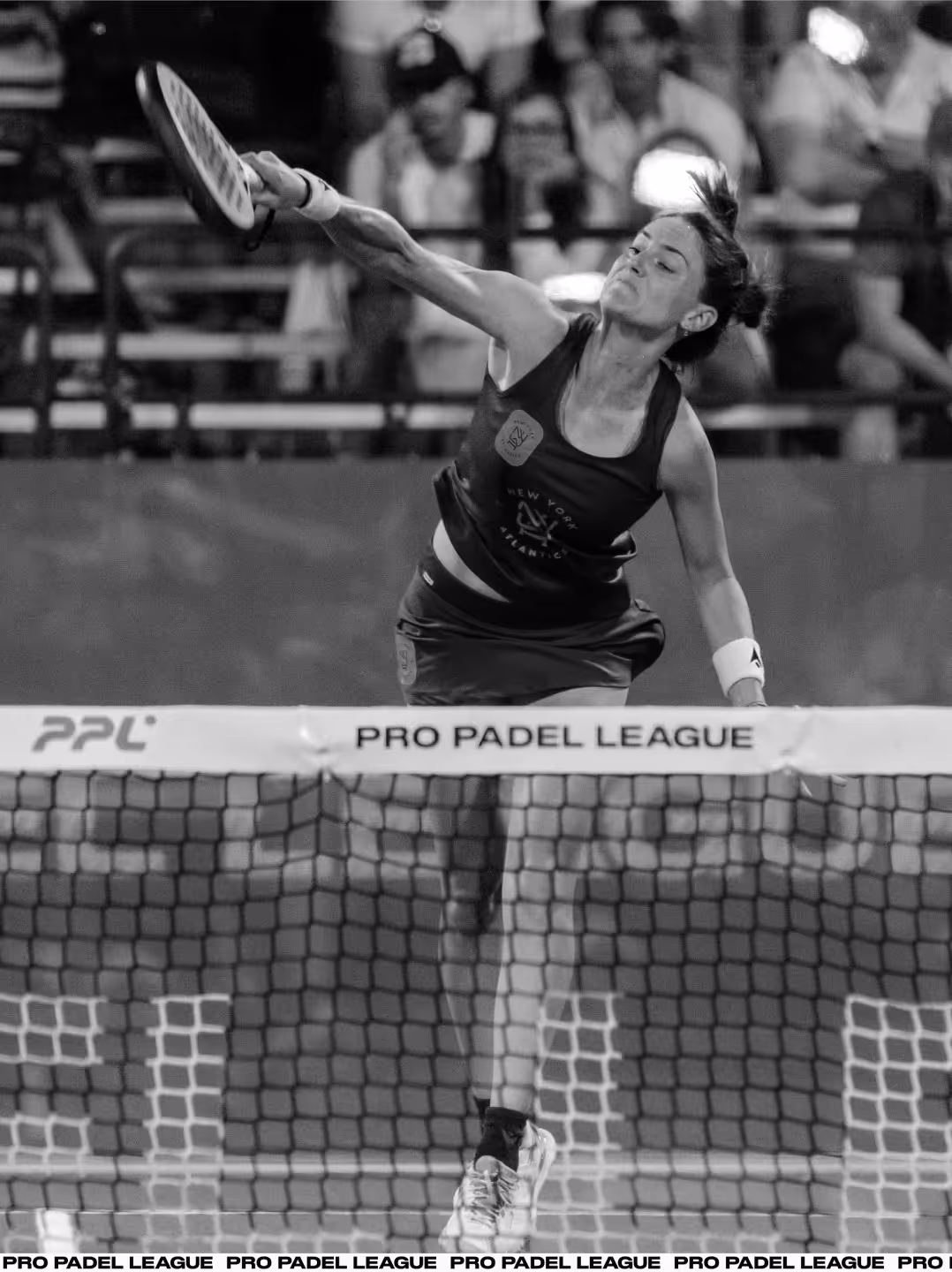
Visual Identity System
Verbal Identity & Messaging
Brand Guidelines
Web Design
Motion Design
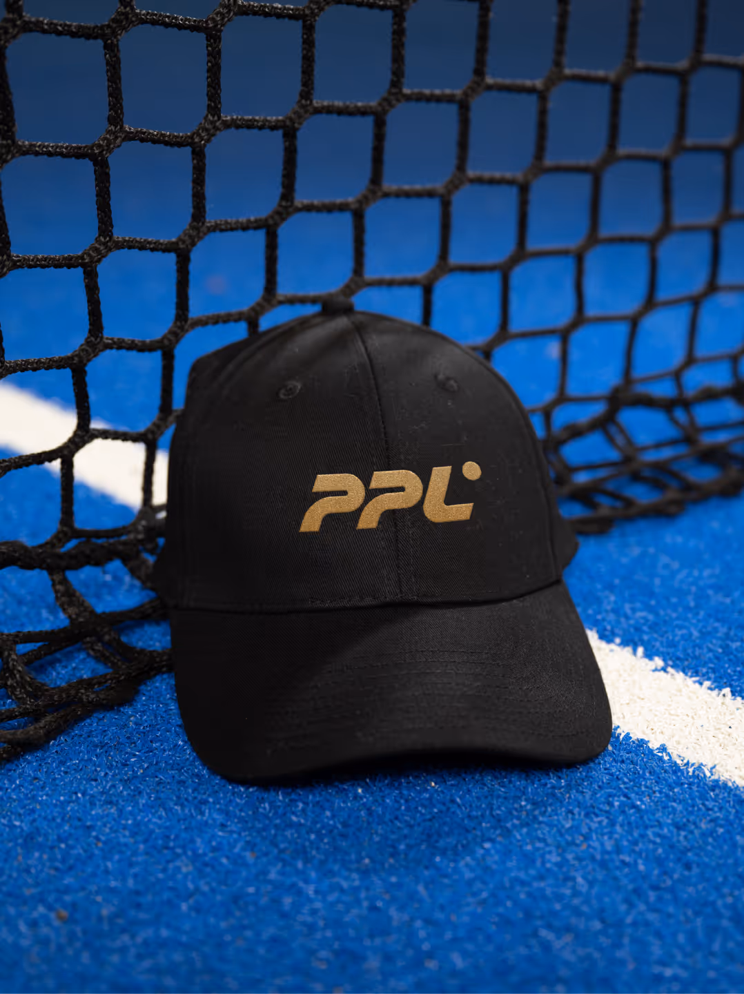
Merchandise Design
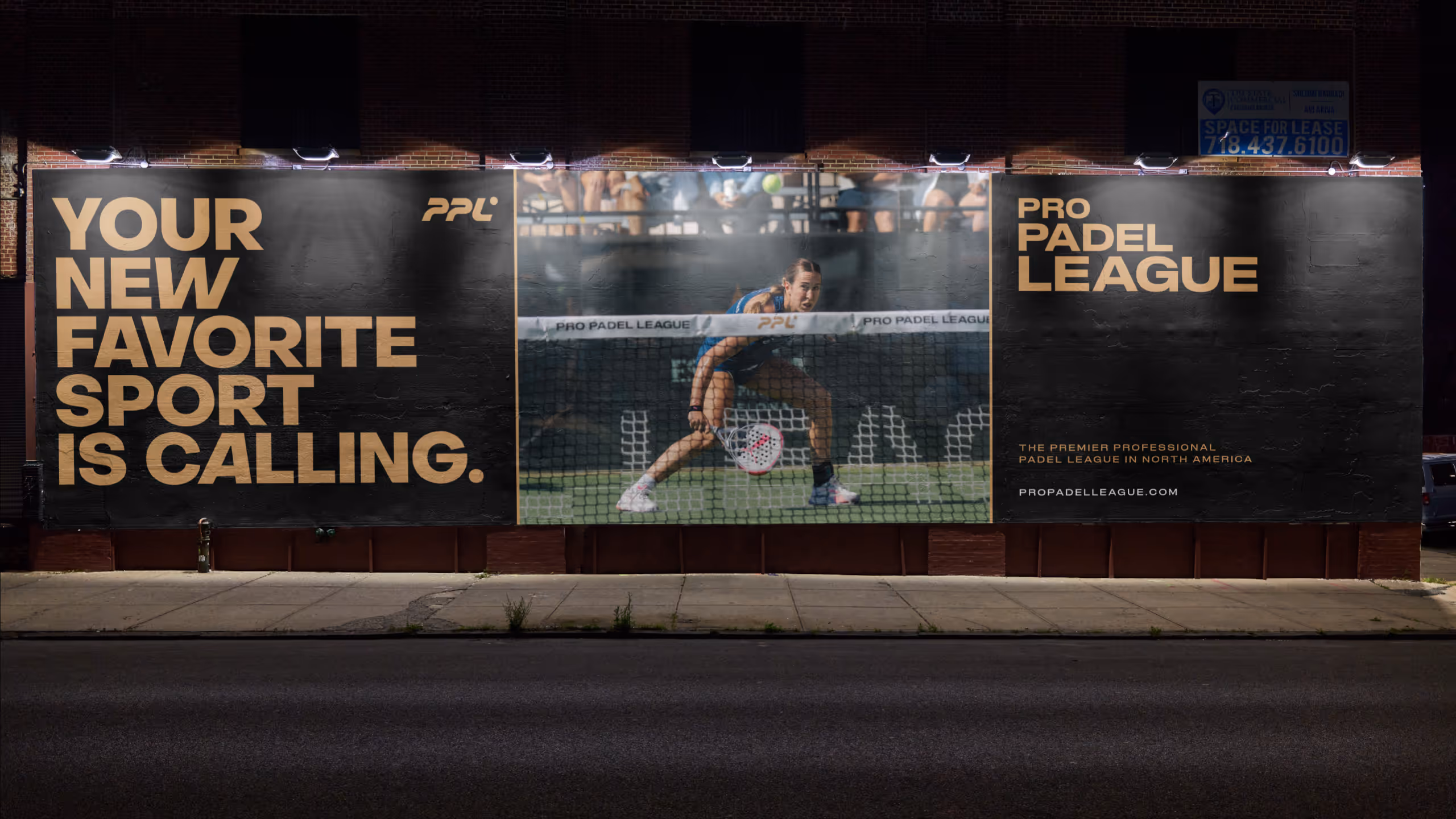
Campaign Development